Summary: iPhone has revolutionized the mobile world like no other product did before. iPhone touch screen clearly was a generation ahead, and Apple’s marketing as always was flawless – but there was something more to this success. iTune made is easy for the application to be distributed. But what made iPhone hit with developers were two reasons: excellent adaptability of device and ease of programming the application on the device. This white paper presents the case study of creating an iPhone application for a famous Hollywood movie. This application was developed by our development team in record time to coincide with the release of the movie in the theaters in the US.
Introduction
iPhone has revolutionized the mobile world like no other product did before. iPhone touch screen clearly was a generation ahead, and Apple’s marketing as always was flawless – but there was something more to this success. iTune made is easy for the application to be distributed. But what made iPhone hit with developers were two reasons: excellent adaptability of device and ease of programming the application on the device.
iPhone liberated the mobile phone UI, expanding its capabilities beyond that of a keypad and function buttons. Besides these changes, iPhone changed the rules for writing mobile solutions in one important way. It was the first phone with full featured browser. iPhone’s Mobile Safari browser is a fully featured web browser. Its ability to view many Internet web pages and execute their scripts opens the possibility that the iPhone can handle certain corporate web-based applications. In this white paper, we will examine the iPhone’s web capabilities by porting a java script flash based web site application to iPhone.
When iPhone was first pitched as a web-application platform, many developers rushed to write native iPhone applications. The phone runs a stripped-down version of Mac OS X, after all. Now that we have worked for a number of years – it is obvious that iPhone can serve a useful platform for all kinds of web applications.
Case Study of A Web Application
In the beginning of this year, our mobile development team at Rapidsoft System’s Mobile Unit got approached by a customer to develop a flash based site to adapt for iPhone. Well, this site turned out nothing but the site for the big Hollywood movie tooth fairy. Now, the studio has already done its glossy Flash based site – but they come to us for developing iPhone based mobile site. The next paragraph describes the movie’s theme (not that it is very important for this case study.)
 |
“The Tooth Fairy,” also known as Derek Thompson, is a hard-charging hockey player whose nickname comes from his habit of separating opposing players from their bicuspids. When Derek discourages a youngster’s dreams, he’s sentenced to one week’s hard labor as a real tooth fairy, complete with the requisite tutu, wings and magic wand. At first, Derek “can’t handle the tooth” – bumbling and stumbling as he tries to furtively wing his way through strangers’ homes-doing what tooth fairies do. But as Derek slowly adapts to his new position, he begins to rediscover his own forgotten dreams. |
The challenge was to transfer the full functionality site to an equally functional Web Application.
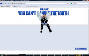
Fig 1: Tooth Fairy Site Being loaded
Mobile Safari Overview and Behavior
First, important thing of iPhone application is to get the terms right. Apple calls an appropriately designed web page for an iPhone an “iPhone application. We are continue to follow this approach since these applications need to be integrated in the iPhone’s look-and-feel.
Mobile Safari brings lots of features to the table for developers. It uses the same WebKit rendering engine that the desktop version of Safari uses. It’s also compliant with a number of the latest web standards: HTML 4.01, XHTML 1.0, CSS 2.1 and partial CSS 3, Document Object Model (DOM) 2, and ECMAScript 3, a Javascript standard. Mobile Safari also supports the AJAX XMLHTTPRequest remote scripting object. These features let the browser render most web pages accurately and manage interactive script sessions.
You probably noticed the word “most” in that last sentence. It’s there for a reason. Mobile Safari doesn’t support Java applets, nor (at this time) does it handle Flash content. The browser is unaware of the phone’s file system, so there’s no downloading of plugins or other files. However, it does support cookies.
Another difference is that in Mobile Safari, certain browser events have changed or have disappeared in order to support Apple’s gestures interface. For example, scrolling through a web page’s content by use of a finger flick requires that the iPhone’s gesture interface capture and consume events that might normally be construed as mouse events. Most mouseover events, if they appear in the browser at all, are now mapped to mousedown events. For the same reasons, the hover style is gone. If your web page uses mouseover events to implement menu choices, you need to rework the Javascript handlers to respond to mousedown events or to clickable elements instead. On the positive side, the form and document elements produce the usual onblur, onchange, and onfocus events.
Finally, Apple’s human interface guidelines dictate that iPhone web pages should be small, and focused on doing one thing very well. There are valid reasons for this:
- The iPhone has a small screen. Cluttering it up with multiple windows or controls makes the web page’s functions difficult to intuit or access. Nor does Mobile Safari support multiple windows, other than the temporary display of alert or dialog boxes over the main page.
- The network interface can vary in throughput. As the iPhone user interacts with your web page, the connection speed to the host can vary as the device moves between WiFi, 3G, and 2.5G wireless networks. Therefore, you must assume the worst-case scenario and design the page for the slowest network. Smaller pages load faster on slow networks, but this also limits the pages as to what they can do.
- The iPhone has constrained RAM and processing throughput. Therefore, Mobile Safari can’t execute web pages with complex scripts. To appreciate this problem, point Mobile Safari to a heavily scripted web-based e-mail service and watch it take the page several minutes to render and respond. There’s a reason the iPhone comes with its own native e-mail application.
In short, the iPhone’s small screen, varying network speeds, and limited processing throughput dictates that you keep your web pages small and simple. You can link to other, separate pages, but they should also follow these guidelines. Lengthy page loads and with sluggish responses are only going to frustrate users so that they don’t use your web application.
Design Considerations
The original ToothFairy web page (www.toothfairy-movie.com) is a full functional flash based site. The site is shown in Figure 1. It makes heavy use of flash elements. The challenge was to transfer the same elements into an iPhone application. As you can see the layout of the web page’s elements were made for a large laptop screen, and not for a mobile phone. The iPhone has a 320×480-pixel screen, which is large by mobile phone standards, but still much smaller than a desktop or a laptop screen. Rather than try to pack everything onto the small screen, it meant that we needed to make some important decision about the layout without losing the vitality and interactive features of the main site.
Framework Features
The iUI framework consists of a mixture of CSS styles and Javascript functions. These provide a set of style selectors that you apply to your page’s HTML elements. The framework then uses Javascript to manipulate the page’s document tree to modify its look. The appearance and behavior of these modified elements mimics that of the iPhone UI. For example, an ordered list of hyperlinks becomes the familiar iPhone list with arrows used to jump to other pages of a program.
There are style selectors for setting up a navigation bar, lists, and hyperlinked lists of information. Other styles help construct panels that contain controls, display information, or provide buttons.
Other iUI features that assist you with writing iPhone web pages are:
- Visual feedback. Some elements flash briefly with the same blue color as the iPhone UI, thus verifying that the element has responded to the user’s tap.
- Conserve screen space. At the top of an iPhone web page is a bar that displays the page’s URL. This URL text field bar consumes a precious 60 pixels of vertical screen real estate. You can temporarily hide the URL by invoking this code:
- <body onload=”setTimeout(function() { window.scrollTo(0, 1) }, 100);”></body>
- This lets you recover those 60 pixels. iUI calls this code for you automatically.
- Handles changes in screen orientation. If the user flips the iPhone on its side, this action generates a change in orientation event that iUI responds to by re-rendering the web page with the new screen dimensions.
To use iUI, you reference its CSS styles file (iui.css), and Javascript functions file (iui.js) inside your web page’s header, bracketed by the appropriate <javascript> and <style> tags.
To recap, you write your iPhone page using HTML elements and tag them with iUI styles. After you put the interface together, you then write your own Javascript functions that carry out the page’s intent. When the page executes on the iPhone, it looks and behaves like an iPhone app, thanks to the iUI framework.
Writing and Testing Code
Because iPhone web pages render in a browser, you can use a standards-compliant desktop desktop browser such as FireFox 3.x, Safari 3.x, or Opera 9.x to write and test a page’s code. The iUI framework makes the web page resemble an iPhone screen even on the PC, so you can also work the kinks out of your web page’s layout before it is ever loaded onto an iPhone. Because IE 6 and 7 don’t support many of the standard CSS selectors, iPhone web pages won’t render properly in this browser. Simply put, don’t use IE.
We started our code port using FireFox 3 along with Aptana’s Firebug to help debug the Javascript functions. While browsers are quite robust in rendering HTML with unbalanced or mangled tags, for a Javascript error they simply abort and don’t render the page, a behavior that can drive you mad. Firebug is really good at catching Javascript errors, ranging from the simple typo to a reference to an object that doesn’t exist, something that can easily happen you’re figuring out how to access objects on the document tree. You can step through the code and watch variable values change as the Javascript executes, which is a good way of confirming that the code really works, rather than it just happens to work.
We were able to get a list display working quickly by using the toolbar style and writing a main list with the <ul> and <li> tags. Although this was only a proof-of-concept program, I then reworked the code so that Javascript built the list dynamically, using a for loop for this purpose. I wanted to see if iUI was capable of handling a dynamically changing list, and the framework passed the test.
Testing Application With Mobile Safari
Once we got the web page working reliably on both the FireFox and Safari desktop browsers, it was time to try the web page where it really counted: Mobile Safari on the iPhone. We placed the program on a web site, downloaded it to the iPhone, and tapped away at the screen. We noticed that what worked fine on the desktop suddenly became misaligned on the phone. We tried several new changes to the css to align but one or the elements will misalign. After a few css, we decides to make some changes to javascript and with some more testing we were able to get it right.
Better Browsing on Mobile
The partial port of the ToothFairy web page shows that it’s not difficult to move a subset of a company’s web-based applications onto the iPhone. We were able to locate and use an off-the-shelf framework and custom Javascript software to impart an iPhone look and feel to the SR web page. Apple’s iPhone has raised the bar on what’s acceptable for a smartphone browser. Mobile users will demand that their browsers be fully capable of viewing the web—albeit painfully slow at times—and executing light-weight web applications. Over time, the performance of both the platform and Javascript will improve; thereby expanding what a mobile phone is capable of doing for us. It should come as no surprise that Apple’s added SquirrelFish, a high-speed Javascript interpreter, to the WebKit rendering engine.
You can expect other smartphone vendors to improve the capabilities of their browsers as fast as they can. When that happens, then we’ll run web apps on any phone that we choose. That’s an outcome that will be good for all of us.
| Steps to Writing an iPhone Web Page
1. Prototype and write the page’s code on a standards-compliant desktop browser, such as FireFox 3 or Opera 9.x I prefer FireFox because then I can apply Aptana’s Firebug to debug the Javascript. Note that for these two browsers that iUI’s buttons don’t render well, but it’s good enough for code testing. 2. If you haven’t already, modify the application’s interfaces so that they don’t use mouseover events. 3. Test and fix the page with the desktop version of Safari 3.x. The iUI buttons render fine on this browser. Clean up any quirks with events or side-effects to CSS selectors. 4. Do final test and revisions on the iPhone. Be prepared for another round of fixes for quirks and CSS side-effects. Also, you may have to tweak the interface for the small screen. Don’t forget to re-orient the phone and verify that you haven’t hard-coded the screen positions of any of the application’s elements or controls! |
Conclusions
Our mobile and Web development team was able to develop this application in the record time. We were under pressure to produce this application in the record time of three weeks to align with the release of Movie in the theaters. However, team did it even better and produced this application in just two weeks. To achieve, this we had to align resources from the web as well as our mobile development team. The important lesson of this migration is that one should do proper planning for iPhone applications since the browser compatibility is still not as good as between desktop browsers.
By following the above common sense approach to software outsourcing, you can truly benefit from the lower cost of offshore outsourcing. The main points are using only professionally run companies that demonstrate a level of professionalism and are willing to provide access to their engineering teams. Besides, your ability to openly communicate can make or break a project therefore having a local project manager for your project with whom you can deal with on daily or weekly basis is very important.